Portfolio Sections
- 1. Research (17)
- 2. Planning (6)
- 3a. Main Product (1)
- 3b. Ancillary Products (3)
- 4. Evaluation (7)
Saturday, 28 April 2012
Monday, 2 April 2012
Sunday, 1 April 2012
Monday, 19 March 2012
Evaluation Part 4
How did you use media technologies in the construction, research planning and evaluative stages?
 In the research and planning stages of my task I used a lot of different media technologies, mainly on the internet as it mainly consisted of looking at existing products and texts. To get a feel of horror film trailers I used YouTube to watch several horror movie trailers. I also used other internet sites such as IMDB.com (internet movie database) to see what horror movies got high ratings and why.
 I watched a wide variety of horror trailers on YouTube but the three than influenced me the most were the trailers for the films Orphan, Silent Hill and The Ring. This is because the trailers didn’t rely on gore to scare the audience. Although I wanted my trailer to be gore-heavy I was interested to know how trailers could strike fear into its audience via other methods. The 30 Days Of Night trailer also intrigued me as the pacing of the whole trailer worked brilliantly to scare its audiences. From these trailers I found that pacing is very important when it comes to horror trailers as building tension and suspense can be done by carefully manipulating shot lengths and montage techniques such as collision cutting.
 |
| This is a screen shot of my magazine front cover in its early stages |
 |
| This is a screen shot of the construction of my poster toshow my use of different layers |
 |
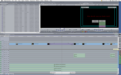
| (FCP screenshot1) This is a screen shot of the fast paced MVC productions showing how we made this short animation |
 |
| (FCPscreenshot2) This is a screen shot of the final cut pro Completed trailer |
 |
| (FCPscreenshot3) This is a screenshot to show our use of the flash frame transition |
 |
| (FCPscreenshot4) This is a screen shot to show our use of the pen tool to fade a shot in and out |
Friday, 16 March 2012
Insanitarium: Evaluation Screening
Evaluation Screening Results
Avg Score 8/10
What did you like about the final trailer?
Music and text go together, Gore looks good, Location, Last scare, music, text was good, Good gore effects, eerie music, good location-loneliness shown through the swing.
What do you think still needs to be improved?
Red writing needs to last longer, plastic knife used to cut neck, text at the start too quick, fire exit stop needs cutting.
Subscribe to:
Comments (Atom)


